


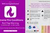
Making sense of a complex data set for your audience means the message needs to be conveyed in a succinct and coherent manner, says David Thomas, commercial director at Ventiv.
Improvements in technology have produced new-age dashboards which are far more advanced than any tools previously seen, revolutionising the way many risk managers report data to their senior management.
”‘How do I demonstrate the value of insurance to my organisation?’ is a question all risk managers are facing,” said David Thomas, commercial director at Ventiv, with a dashboard being one option.
Making sense of a complex data set for your audiences, such as senior executives or mid-tier managers, means the message needs to be conveyed in a succinct and coherent manner.
The dashboards built for each client are different, said Thomas, but each dashboard must be interactive so that stakeholders can be quizzed in-depth on data. “You must be able to be interrogated from senior management so that the data remains relevant to them.”
The ability to producing new and different content each time will keep the content relevant to senior management, said Thomas.
“You are showing far more information and can be challenged on any of the data in the dashboard which makes it a far more valuable tool for risk managers and c-suites. Bringing in visualisations that are different from your usual bar charts and pie charts,” said Thomas.
“Dashboard tools have moved on and are now able to automatically work out what type of chart is best to present the data. You no longer need to be a technical expert. The technology will do it for you,” said Angus Rhodes, global product manager.
“As a risk manager, you no longer have to be a stats expert because the tools make it very simple for you to present this information to your board,” he added.


No comments yet