


In this new opinion piece renowned author, blogger and retired chief audit executive, Norman Marks explains why you may have been making a fundamental error in risk management
Almost everybody makes a fundamental error when it comes to assessing a risk (what might happen).
It doesn’t matter whether they are using a heat map, a risk register, or a risk profile.
They show the level of risk as a point: the likelihood of a potential impact or consequence.
But 99% of the time this is wrong.
99% of the time, there is a range of potential consequences, each with its own likelihood.
Even if you ignore the fact that there are more often than not multiple consequences from an event, situation, or decision, anybody trying to understand risk and its effect on objectives needs to stop presenting the level of risk as a point.
This was brilliantly illustrated in the Ponemon Institute’s latest report on cyber. Their 13th Cost of a Data Breach Study (sponsored by IBM) is an excellent read. It has a number of interesting findings that I will discuss in a separate blog.
The content that is relevant to this discussion is a graphic that shows the range of potential consequences from a cyber breach. Their graphic shows the likelihoods of having anywhere from 10,000 to 100,000 records stolen. (They separately discuss the cost of what they call a ‘mega breach’, when more than a million records are stolen.)
Using their number for the average cost to the business (across all sectors and geographies) of the loss of a single data record, I created the graphic below. (The probabilities are for the next 24 month period.)
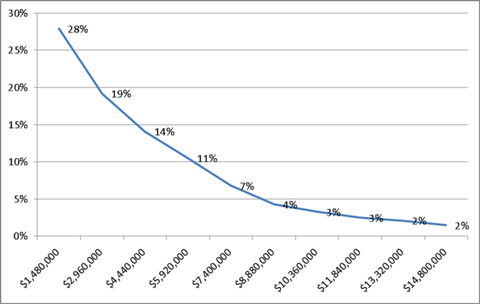
As you can see, in their estimation a cyber breach can result in a loss that is anywhere from $1.5 million to $14.8 million. (The losses suffered by organizations in the medical sector are about triple that amount). They can extend to $350 million for the very few who have 50 million records stolen.
If this is reality, which point do you select to put on a heat map or risk profile?
If you want people to make intelligent and informed decisions relating to this risk, they have to understand the full picture. That picture starts with a chart that shows the range of potential consequences. Ideally, it shows how they might affect enterprise objectives.
What is an acceptable level of risk? For certain it’s not an ‘amount’, as preached by COSO. I talk about an acceptable likelihood of achieving your objectives.
But let’s just focus on this graphic for now.
- · Is the range of potential consequences and their likelihood acceptable?
- · Are there any individual points in the range that are unacceptable?
- · Does it make sense to use techniques like Monet Carlo to replace a chart with a single number?
- · How do you provide actionable information that enables intelligent and informed business decision?
I would love to hear your thoughts.


1 Readers' comment